Logo design is more than just freelance and graphic work. Your logo brings life to your brand, while also making it stand out from the crowd and relate with audiences in ways other marketing campaigns can’t.
Just take a look at names like McDonalds, Starbucks, Nike and Target, who can all use their logo identity and not even need to mention the brand name for audiences to know what it is. Now that is brand power!
However, not all businesses and brands get their logo design correct the first time around. Or maybe the problem is that it’s an old idea and the company is looking for a fresh new look. No matter what it is, re-branding and logo redesign is on the rise.
Doing an entire corporate rebranding can cost anywhere from a few thousand dollars to tens of thousands of dollars. With that kind of investment, you want to make sure that you get it right.
Take a lesson from these companies and their logo redesigns. By learning their approach, you can make your new logo an effective one.

1. Morton Salt
The Morton Salt logo first featured the iconic little girl with an umbrella in 1914. Over the last century, she has received updates to stay current with hair and clothing fashions. This has led to redesigns in 1921, 1933, 1941, 1968, and 2014.
What’s brilliant about Morton’s logo update is that they stay true to their brand. Instead of following marketing trends, the company keeps current with social trends. This ensures the company remains true to its personality while also staying current in society.

2. Netflix
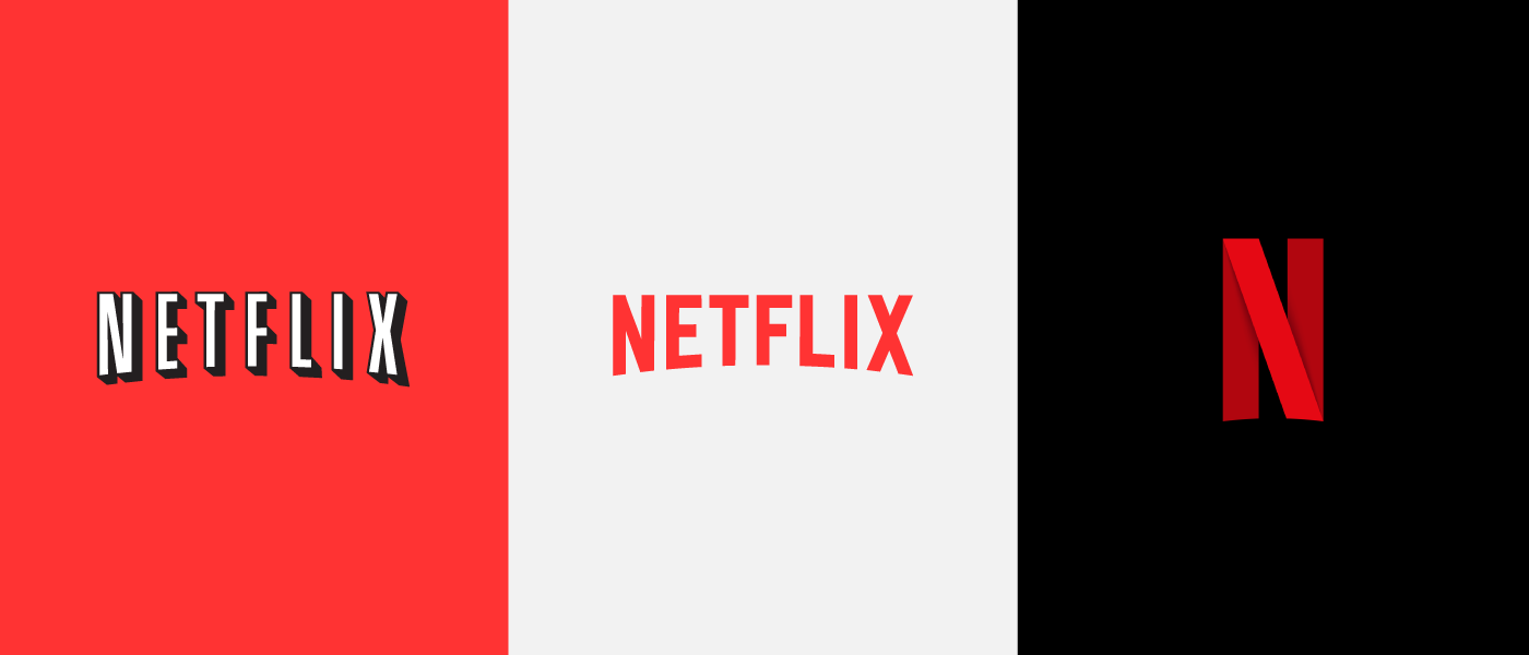
Do you remember when Netflix was a mail-order DVD rental company? It seems like a lifetime ago when you compare it to the streaming behemoth that it is today. So with the change in direction, a logo update was long overdue.
The old logo worked well for the red envelopes as the black outlining and drop shadow popped on the vibrant red. The new logo leaves the shadow behind and focuses on the red color, which is the brand’s identity.

3. Pizza Hut
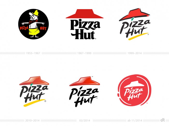
The original Pizza Hut logo used four different colors. It’s also a bit busy in the design. The company made a smart choice by reducing the number of colors down to one, red.
Not only is red a brand color for the company, but it’s a common color associated with Italian restaurants. It also evokes feelings of hunger.
One signature feature of Pizza Hut is the slanted roof. The company was smart to keep this identifying feature in its new logo.
4. Olive Garden
Olive Garden needed to update their logo because their original one was everything a logo shouldn’t be. It looked more like a street sign. It’s almost as if the local family Italian restaurant got bought by a corporate name, and they never bothered to update the logo.
The new logo brings the chain into modern times and embraces the new healthier menu. The simple font cleans the logo up and gets rid of the distracting details. They also replaced the off-brand grapes with a more fitting olive branch.
5. Marriott
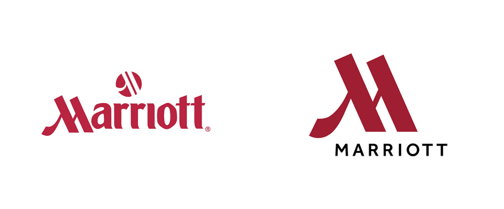
Marriott did a beautiful job of giving its logo an update. While there was nothing inherently bad about their old logo, the new one is simplified while staying true to Marriott’s brand identity.
Instead of using the entire Marriott name, the logo was trimmed down to be just the fancy M. This draws your attention to the elegant M. It also makes the logo much easier and smaller to use on outdoor signs and in the room.
If you want to create a Marriott style logo, then try using a logo creator. Take a look at your logo and see if you can choose a letter or two to create the logo.
Get Inspired by These Logo Redesigns
One reoccurring trend throughout each of these logo redesigns is that the company stayed true to the brand’s image and personality. Each company looked at how it could take the core elements of their old logo and rework it to have a fresh and modern feel.
As always, we cover a wide range of topics on ZacJohnson.com, so be sure to browse our blog for more business-related articles to help make your venture a success.
The post 5 of the Best Logo Redesigns of All Time (Updated for 2020) appeared first on Zac Johnson.
from Zac Johnson


Comments
Post a Comment